Book a Call
Whey'Mo
15
Whey'Mo
15
Whey'Mo
15
Whey'Mo
15
Whey'Mo
15
Project Information
Project Information
Project Information
Year & Location
2018, Helsinki, Finland.
Assignment
Brand Concept, Naming, Brand Identity Design, Visual Style & Direction, Packaging Design
↓
Whey'Mo, a wellness brand based in Helsinki, Finland, was brought to life by FOR® Agency in 2018. The mission was to make health supplements appealing and effective.
The name “Whey’Mo” is a playful twist that reflects the brand’s youthful energy and dedication to promoting a healthier lifestyle through whey protein and more. From the outset, the goal was to create a brand identity that was as lively and dynamic as the products themselves.
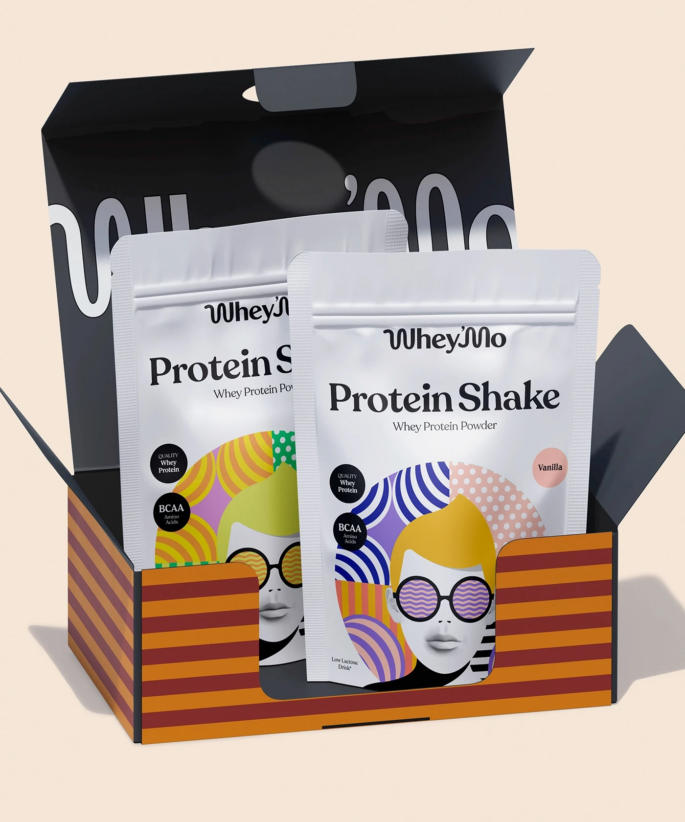
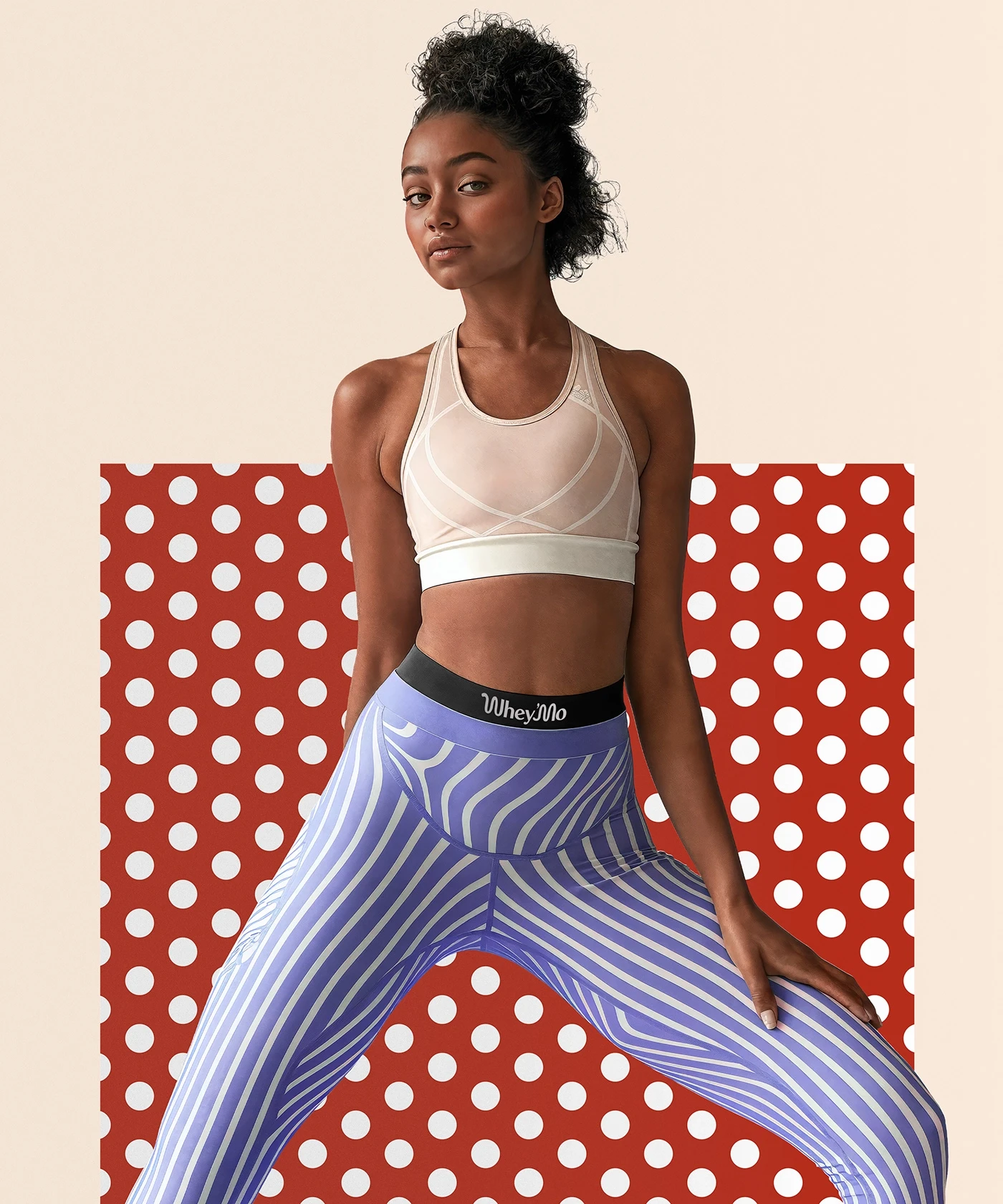
Designing the packaging for Whey’Mo was like painting on a blank canvas with a palette of energetic colors and bold patterns. Each product needed to tell its own story while fitting into the cohesive brand narrative. The use of bright stripes, polka dots, and striking contrasts with retro pop vibe not only makes the products stand out but also brings a sense of joy and excitement to the consumer experience.
(Later on Whey'Mo name has been changed to Hey'mo).
All rights reserved © FOR®


